Walking the invisible line between art and design
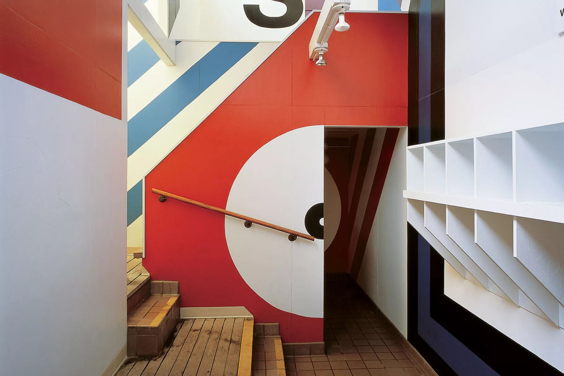
At 91, Barbara Stauffacher Solomon has gained an international following. She spoke to Margareta von Bartha about pyjamas, bold typography, and finding her voice as a woman
Barbara Stauffacher Solomon – or ‘Bobbie’, as she is often known – has gained international recognition for her work as a graphic designer, artist, and landscape designer. At 91, her career spans eight decades, and comprises iconic works such as the bold signage of Sea Ranch, in her native California, and the large-scale, interior ‘supergraphics’ from which she has become indissociable.
In 1956, Solomon came to Switzerland to attend the Schule für Gestaltung in Basel – studying under the famous graphic designer Armin Hofmann. His other students included Margareta von Bartha who, with Miklos von Bartha, went on to establish von Bartha Gallery. Here, Margareta and Barbara revisit that period, speaking via phone call – discussing the thin, and sometimes invisible, line between design and fine art, and the struggles faced by two young women trying to find their way into either world in the 1960s.
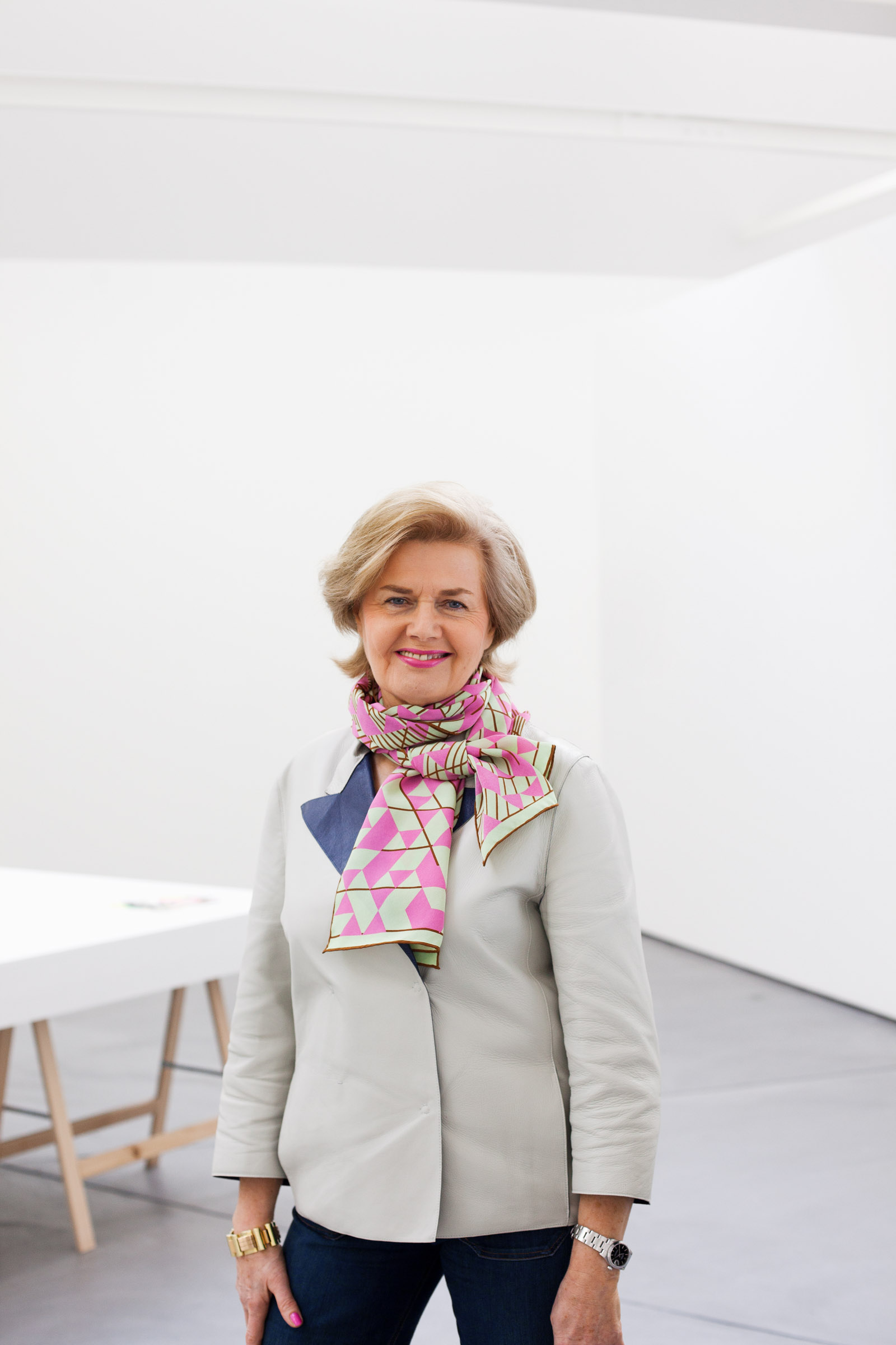
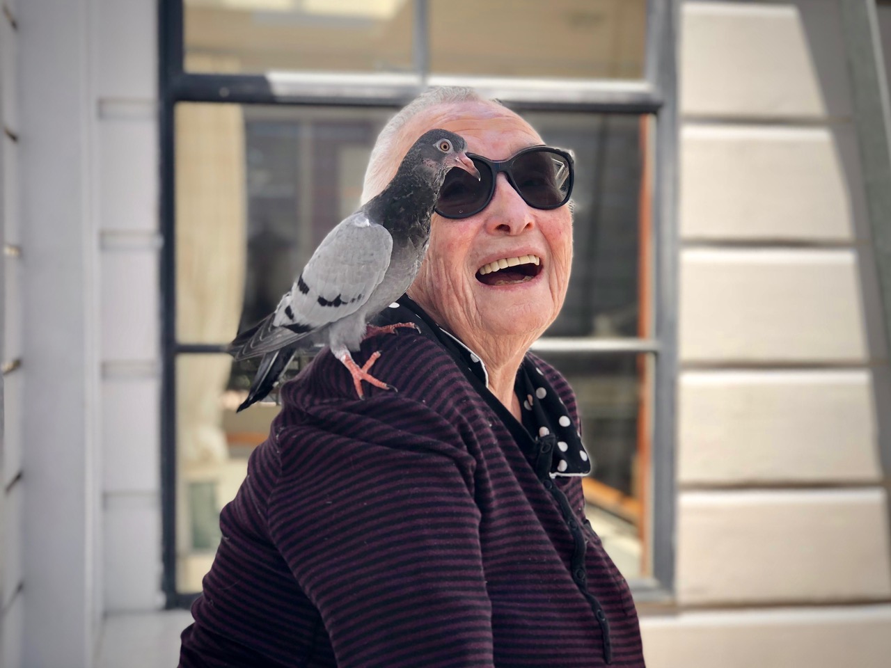
Margareta: So, Bobbie, are you ready for our quick interview? I have some very easy questions, so you’ll have no problem replying.
Bobbie: What?
You won’t have a problem replying, because, I mean, they’re very basic questions like ‘What are you wearing?’ (laughs)
(Laughs) I haven’t left the house for six months, so I’m wearing some kind of large pyjamas
That’s very comfy!
It’s marvellous! I love it – I don’t have to get dressed; I don’t have to put on make-up… wonderful!
Very true! Ok – I’ll start my real questions. You’re not just a great artist, but a great writer. I read your essay on moving from the US to Basel in the ‘50s, with your mother and three-year-old daughter, to study graphic design. I thought it was very brave of you – and it turned out well as, like me, you were able to study under the brilliant Armin Hofmann. Did you find his teaching had a crucial impact on how you view both art and design?
Totally! I had studied art, and received scholarships from the San Francisco Art Institute. But, when my husband died, in 1955, I suddenly had to earn a living. A friend of mine had met Armin at a design conference and mentioned him to me. At that time, I just wanted to get away from San Francisco. The people there were watching me to see what I would do next – it was horrible. Armin and his wife Dorli (Dorothea Hofmann) were marvellous.
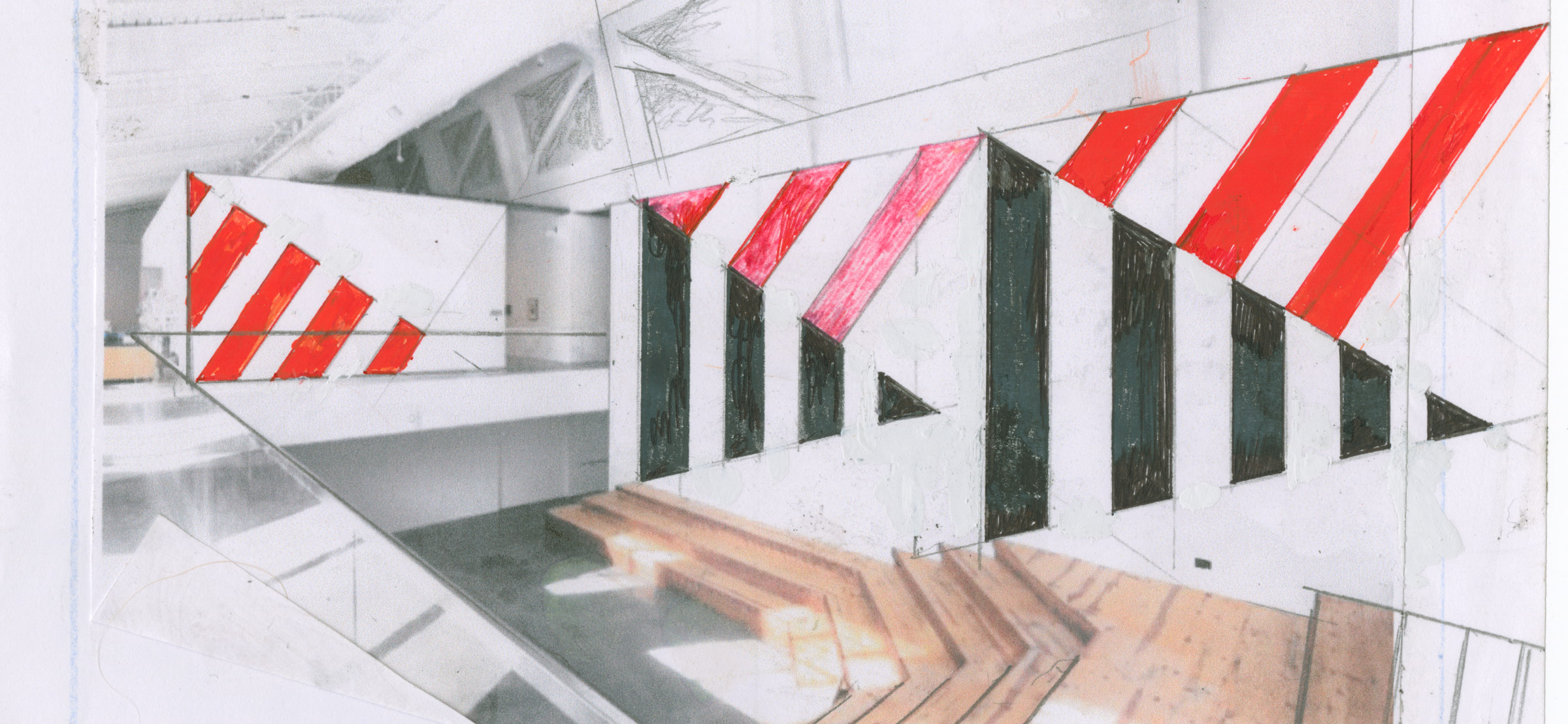
Supergraphic for the Art Wall at BAMPFA, Berkeley Art Museum
So do you find Armin’s training still shapes the way you approach projects? Of course you do! Well, it does with me too, actually!
What? The training? Oh, totally! Totally! I always have. When I moved back to San Francisco in 1962, I had to order Helvetica (the font) because it didn’t exist in the US at that time. I had to get a public typographer in Switzerland to send it to me. When I worked, I always did exactly what Armin taught me – as though he were sitting there, observing me the whole time. He would say things like ‘it should be a clear situation’ – and he had rules about everything. You know, you studied with him!
So he was looking over your shoulder all the time!
Totally! Totally!
It would also be interesting to hear what projects you are most proud of? Or which have meant the most to you?
I like all of the new work I’ve created in the last couple of years. The big wall I did at the museum in Berkeley, and the show I had at LAXART are, I think some of the best things I’ve ever done. That show is now going to the Graham Foundation in Chicago, but I’ve redesigned it for the space; at LAXART, it spanned a single room, whereas in Chicago its 16. I’m working on the project on my walls at home, then I’ll send it to the Graham Foundation, and we’ll install it via Zoom! I’m placing the words ‘Exits Exist’ across each room. The project is very similar to a book I’m doing, focusing on the form each letter takes.
That’s a major project! Would you say it’s an example of the large-scale text, or ‘Supergraphics’ you’ve become known for?
Yes! I didn’t coin the name – I would call what I created ‘Supersigns’. But an article in PA Magazine used the word ‘Supergraphics’ and it stuck.
I find it annoying that fine art is viewed as being superior to design – do you agree?
It’s very annoying. Because, in my mind, when I paint walls, it’s art – but I’ve had to call myself a graphic designer. In 1962, no artists got paid – I wouldn’t have been able to earn a living. But, by calling myself a graphic design, I was paid as though I were an architect.
Design is still considered ‘lower’ than art. Today, nobody knows what to call me – some call me an artist, and others call me a graphic designer.
What do you call yourself?
I don’t know. I say, I do that… stuff (laughs).
Yes, I sometimes find it difficult to explain my interests, but that’s also because I’m shy – but you’re probably not! (laughs)
You see, before I wrote my book Why? Why not? I was very hesitant to talk! I had husbands who were brilliant talkers. But as women, we were expected to keep our mouths shut – it was smarter to do so. After I wrote that book, however, it became easier. I had to speak!
Yes! Well, it’s a very good sign, I think, it’s a good development!
I guess so. I mean it was just, I had to, you know.
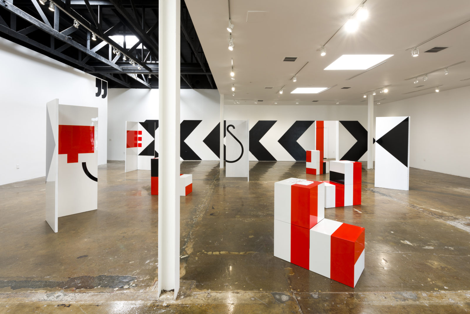
Exhibition view, LAXART, Los Angeles
courtesy of LAXART, Los Angeles. Photo by Ruben Diaz
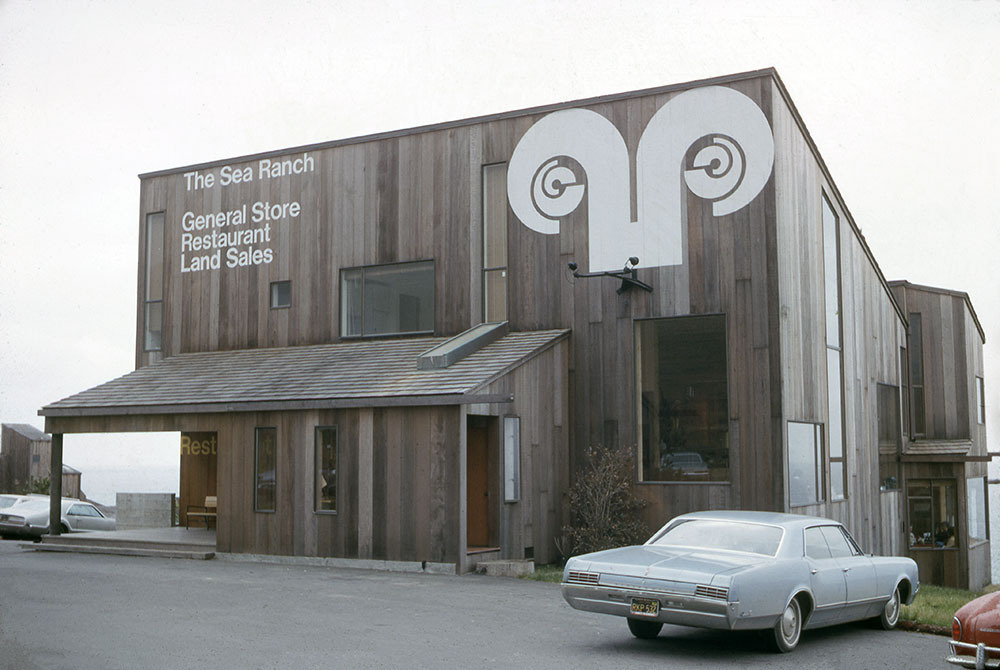
Photo by Lawrence Halprin, courtesy of the Trustees of the University of Pennsylvania, held by the Architectural Archives
But it would be interesting to hear what you think about our new anniversary book: von Bartha Est. 1970. There were many discussions around it, because Miklos (von Bartha) and I – who, like you, had this very strict upbringing by Hofmann – had difficulties with the graphic design of the book. Stefan (von Bartha) had to defend it every once in a while because the aim was to do something new and unconventional.
But you did it on a grid, didn’t you?
(Hesitant) No…
I would never make a book without a grid! (both laugh)
You see! We agree!
Never! I even do grids for the drawing. I have a strict grid. Even if I break the grid, I have it there.
So, that was a bit difficult, but we are very happy with the result.
– (Pause)
Bobbie, are you still there?
What? Yes, I’m here! I’m waiting for the next question!
Well, that was it! Sorry about that! (laughs) You want to tell us anything else?
Really? That was very short. (laughs) Well you should read my last book Making the Invisible Visible it is my final say on just about everything.
Barbara Stauffacher Solomon features in The Backwards Glance can be a Glimpse into the Future, our 50th anniversary exhibition in Basel. See more >
- Header image: Sea Ranch, supergraphics by Barbara Stauffacher Solomon 1968 / Jim Alinder/Princeton Architectural Press

Waves, 2012
Graphite and colored pencils on paper
Ten parts, 27.9 x 21.6 cm each
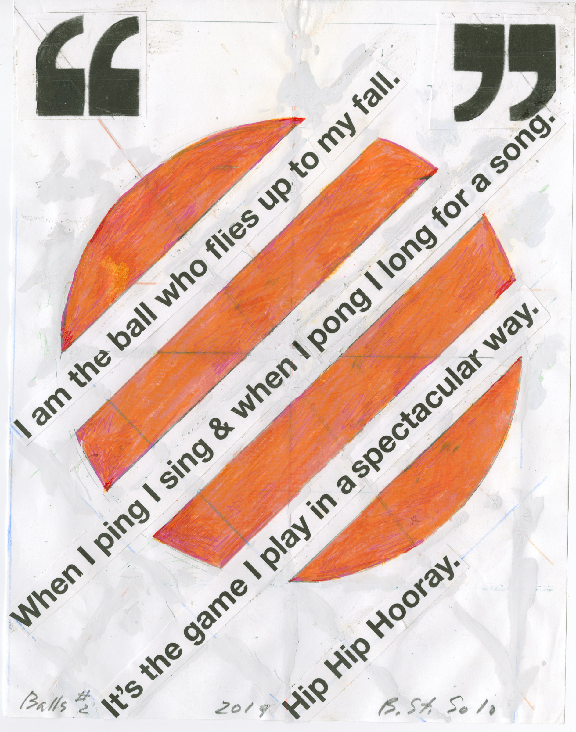
Balls #2, 2019
Mixed media: Pigment print collage, gouache, ink, graphite, colored pencil, white-out, cellophane tape, rubber cement, paper
27.9 x 21.6 cm
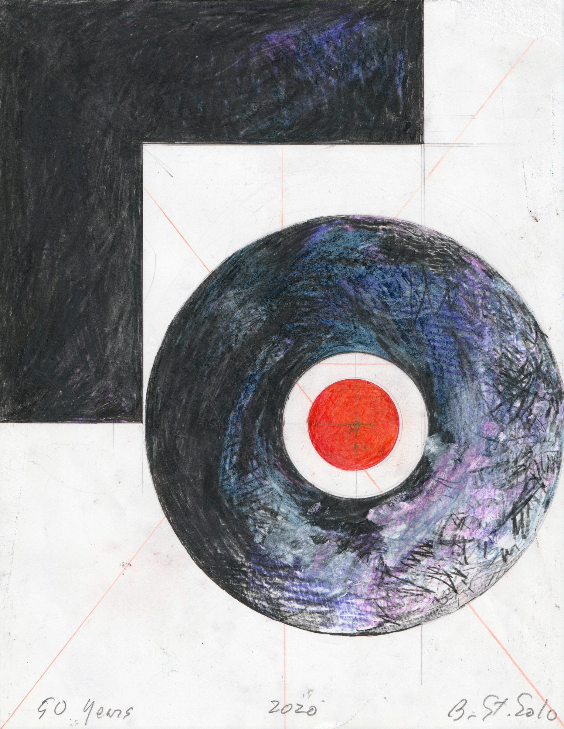
50, 2020
Colored pencil, graphite, ink, paper
27.9 x 21.6 cm
