
How Barbara Stauffacher Solomon rewrote the alphabet

The multidisciplinary artist explains how a project with Francis Ford Coppola sparked the creation of her new BSS alphabet
by
Julia Paas, von Bartha team
The alphabet: we are surrounded by it; we use it every day. But when was the last time we thought about it? For Barbara (‘Bobbie’) Stauffacher Solomon, the answers is quite a lot. A graphic artist, designer, architect and painter, Solomon has a degree in history and linguistics, and studied graphic design with Armin Hofmann in Basel. She belongs to the generation that popularized the aesthetics of Swiss design and typography in the USA – and she has spent years designing and developing her own alphabets and unique typefaces. But how do you create your own alphabet? von Bartha’s Julia Paas spoke to the artist, whose exhibition GROP is currently on display in our Basel space – delving into her semiotic laboratory.
Julia Paas: In your book WHY? WHY NOT? you describe that the first thing you had to create in class with Armin Hofmann at Basel Kunstgewerbeschule in 1955 was an alphabet?
Barbara Stauffacher Solomon: We weren’t creating it, we were copying it! We could do it long and skinny or tall and skinny, or square, you know – he let us have the choice of what proportions – but after that it was straight Helvetica.
So you weren’t allowed to make any modifications?
Oh no! When you study Swiss graphics, you had no self-expression.
One of Barbara Stauffacher Solomon's new SuperSigns works. Photo: Courtesy of Placewares
Did you continue to create letters and alphabets after that?
Actually, I came back from Switzerland and was living in New York where I had a job at Geigy (Swiss pharmaceutical company) and I did an alphabet for them. It was just a straight Helvetica – skinny letters – so they could put it on their bottles. But, other than that, I used letters in supergraphics (Note: large, environmental graphics that are applied over floors and walls). I then didn’t make an alphabet until much later, when another job came along.
What kind of job was that?
It was two years ago when the literary magazine ‘ZOETROPE’, published by Francis Ford Coppola, asked me to be the guest designer for one issue. I decided to use the 8 letters of the name big in the size of the magazine as division’s between the 8 stories in that edition.
So you started with the letter Z – and that led to the creation of the BSS alphabet?
Exactly! I love to do the Z! I did the letters and signs necessary for that job and then I continued with the rest of the alphabet. And, since then, I’ve also used it in my books…I’ve been designing four books since the Covid.
Besides your beautiful art books, where do you see your alphabet being used for?
I mean, it’s only capitals and it’s made to be big on walls, you know…but it’s made also to be used for supergraphics. I’m horrified to think how people are going to copy it and do it all wrong and everybody’s going to say it’s my fault (laughs loudly).
When it becomes an official font that might not happen anymore, I hope! So the BSS alphabet is complete now?
Yeah! The thing is, when I use it, I change the letters so the proportions of the white space in between are perfect. You know, I don’t just use them. I change them to make them look better. They don’t always go together perfectly. You have to make adjustments. And that’s what nobody else is going to do, or know how to do. I mean, I had all that marvelous training from Hofmann, I can letter like mad, you know!
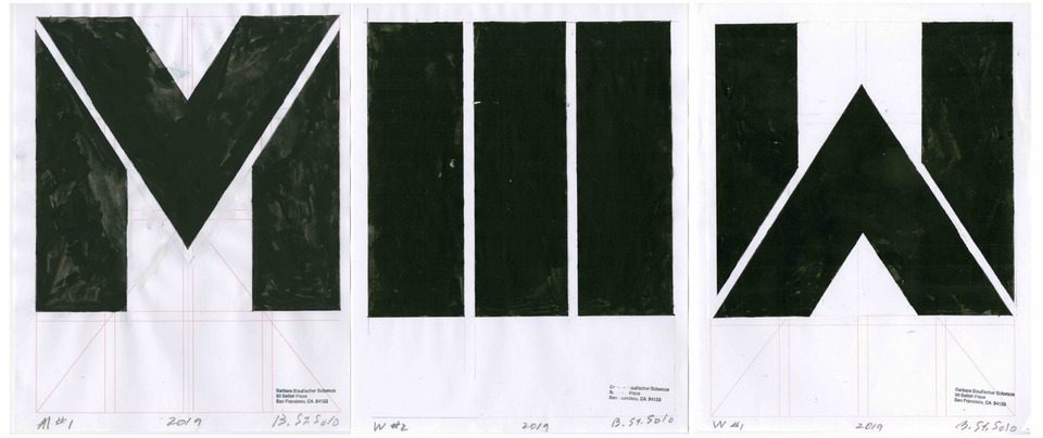
M, M/W, W
letters from the BSS alphabet
by Barbara Stauffacher Solomon
Adjustments and also alternatives – you designed two versions for some letters, an easy and a less easy one to read, the M and W look exactly the same…
I know they look the same! I just leave it that way and let it up to the people. But that’s alright, because I don’t use it for text, I use it only for big words. You know like we’re going to use it for the word WELCOME in St. Moritz. And people will just have to figure it out. I keep saying, well, that makes it art, it’s unintelligible, so therefore it’s art.
Yes! You write in your book that the void or white space is even more important than the black of the letters?
Totally! That’s what you learn in Switzerland: white space!
There is a strong tension in between the white and the black space…
Yes, the letters create the negative spaces in between them. You’re doing the letters, but you’re looking at the white spaces and when they look right and beautiful, then you know: Okay, that’s it! That’s the solution!
I see… most of the letters look very solid and powerful and then there are a few others, the slim and diagonal ones with very small apertures…
Yes, exactly, the P, R and S – make interesting shapes! It’s the whole idea of lettering – playing, you know! And lettering being art, instead of making squares and circles, the lettering is making squares and circles. I also have a degree in linguistics, you see, and so I enjoy playing with words!
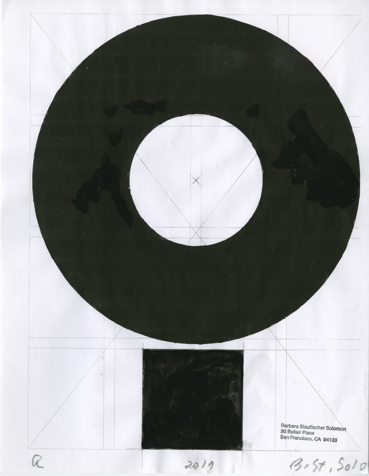
Barbara Stauffacher Solomon, Q
Letter from the BSS alphabet
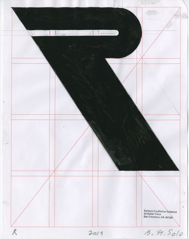
Barbara Stauffacher Solomon, R
Letter from the BSS alphabet
Every single letter looks perfect in itself; they have like a sculptural quality, the Y and Q are standing out especially, floating on their pedestals…
That’s what I’m doing! That’s on purpose! I’d like to see a show on the relationship between the meaning of the word and the look of the word. That’s what the whole subject is! Are we writing or spelling out the words or are the words spelling? And we only think, we’re doing it but they know they’re doing it?
How do you think typography and lettering is evolving as our modes of communication become shorter and more pictographic, for example with acronyms, emojis…?
Yes, now everybody uses them all the time. Writing is getting easier than talking! You know, I have read all these philosophers where it takes a whole book to say something – you can do it in a sentence. I love peeling all that down to its essence, it is minimalism!
For example the ’couple’ of the words HE and HER…
The look of the letters, you know, they turn into art and they are beautiful!
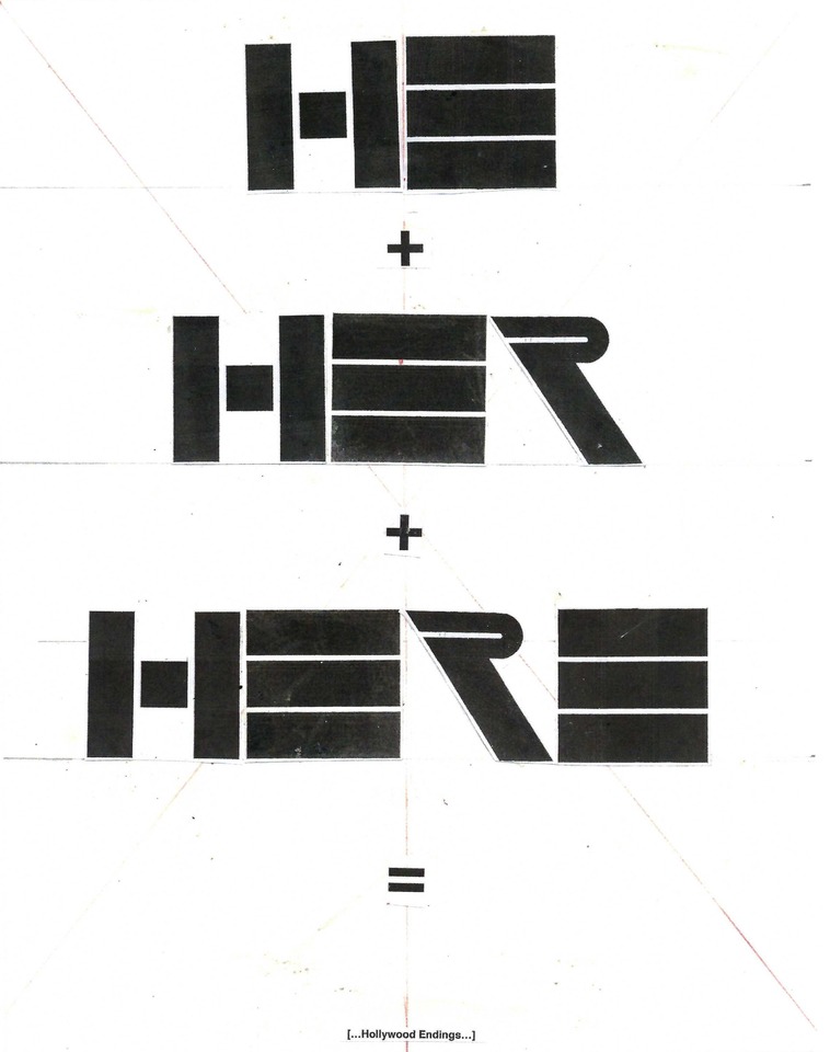
Barbara Stauffacher Solomon, HE + HER + HERE = (...Hollywood Endings)
From the book "Ditto", 2020